Nadex New Web Platform
Six months after launching the Nadex PWA, the company decided to retire its 11-year-old desktop trading platform. Designing the replacement meant asking not how to translate the mobile experience to desktop, but what would genuinely be better on a larger canvas.
Context
Retiring an 11-year-old platform
Six months after launching the Nadex PWA, the company decided to retire its 11-year-old desktop trading platform. The legacy system had accumulated significant technical debt. Maintenance was costly, performance was degrading, and the architecture made meaningful improvements increasingly difficult to deliver. The decision to shut it down was straightforward. Designing a modern desktop replacement that built on the PWA foundation, whilst addressing the limitations of a mobile-first design on a larger canvas, was the more considered problem.
Problem
Not translation: reconception
The team had an existing foundation in the mobile PWA, built over the preceding eighteen months. The challenge was not starting from scratch, but it was not simple translation either. Tasks that worked on mobile through linear, step-by-step structures needed to be reconsidered for the desktop context, where users had different expectations, more screen real estate, and different interaction patterns. The question I wanted the team to hold throughout was not “how do we make this work on desktop” but “what would genuinely be better on desktop.”
My role
Design direction and distributed team management
I led the design work and managed a two-person team comprising a UX designer and a UI designer. I was responsible for the overall design direction, facilitating the design sprint that shaped the initial platform vision, and managing the relationship with the Nadex team in Chicago throughout the design and review process.
Process
Framing outcomes before generating ideas
The first step was establishing a clear goal for the design work. Not simply a business objective, but a shared understanding of who the platform was for, what it needed to enable, and how success would be defined. Generic goal-setting produces generic design. At the start of the sprint I worked with the team to frame the goal in terms of specific client outcomes rather than features: what would a client be able to do that they could not before, and why would that matter?
This framing gave the team a reference point for evaluating ideas throughout the week. When a proposed direction did not demonstrably move the platform toward the stated goal, there was a shared basis for setting it aside rather than debating it on preference.
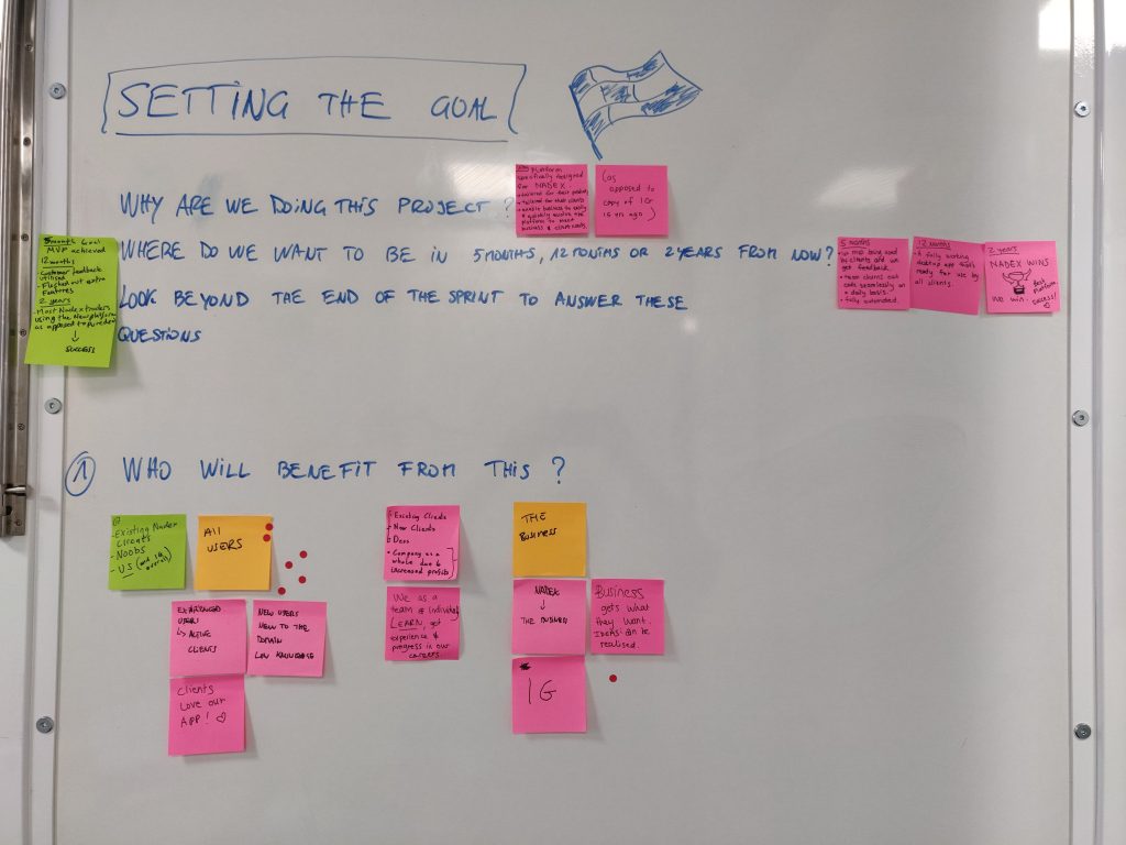
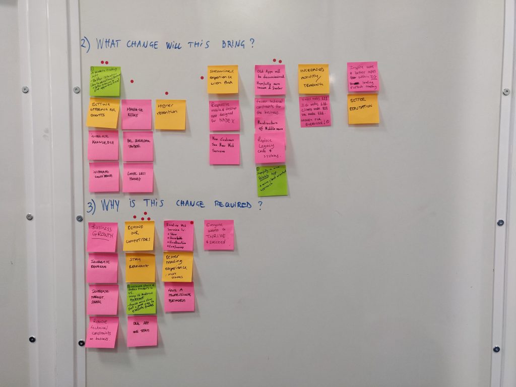
Goal-setting, sprint day one. Framing the goal in terms of client outcomes rather than feature delivery gave the team a consistent basis for evaluating ideas throughout the sprint.
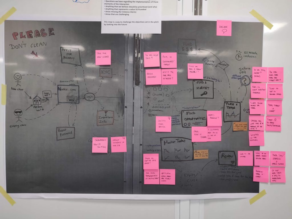
Journey mapping: from mobile to desktop
The team’s first design task was to evaluate how the existing mobile flows would translate to the desktop context. I asked the team to map three primary client tasks across both surfaces: opening a position, reviewing account performance, and completing the withdrawal process. Comparing how each task played out on the PWA against the expectations of a desktop interface surfaced a set of specific translation challenges.
Flows that worked on mobile through sequential steps would benefit from parallel presentation on desktop. The navigation structure built for a mobile context was not appropriate for a keyboard and pointer environment. Several interactions that were natural on touchscreen would become friction on desktop without redesign. Whilst the brief had initially been framed as a “translation” of the PWA, this exercise made clear that several flows needed genuine reconception rather than responsive adjustment.
Design Sprint
Generating and evaluating directions
With the goal and journey maps in place, the team ran a sprint focused on generating design directions for the platform’s key experiences. This included a structured competitor review, individual sketching, and a crit session that produced a shortlist of directions to develop into digital designs.
The central challenge in the sketching phase was maintaining consistency with the mobile PWA. The two products would coexist for clients who used both, and inconsistency between them would create a disorienting experience for anyone switching between surfaces. Establishing the boundaries between what should be consistent (core interaction patterns, visual language, terminology) and what could legitimately differ (layout, information density, navigation structure) was a design decision that ran through the whole sprint.
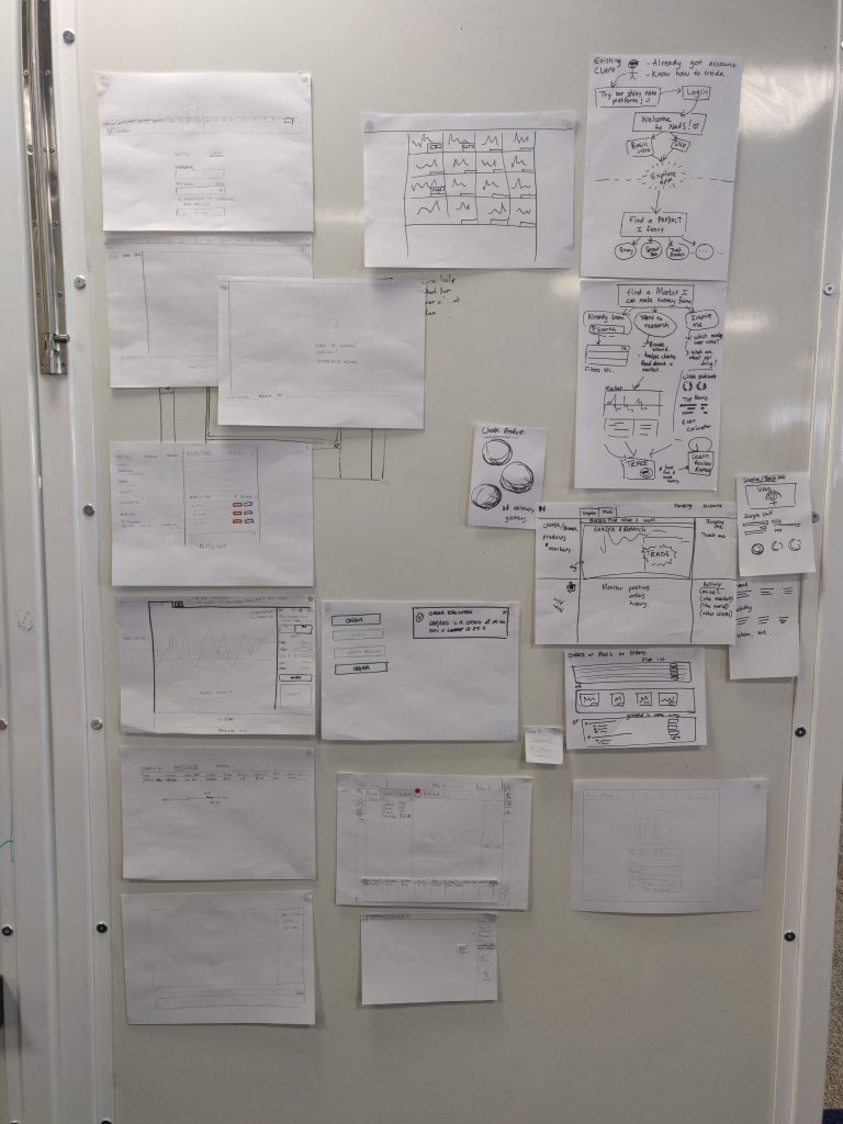
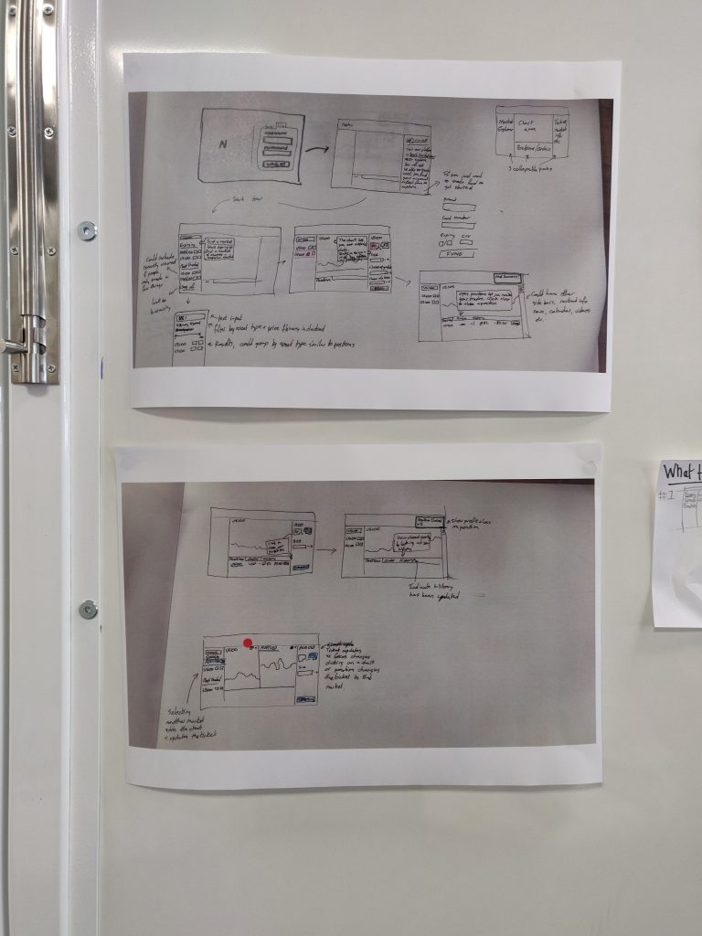
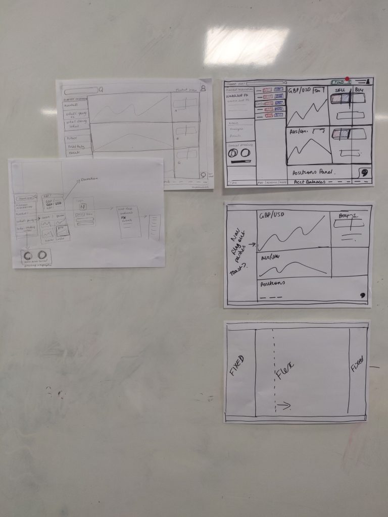
Sprint sketching, day three. Each designer produced distinct directions for the platform’s primary trading view. The annotations capture the reasoning behind structural choices, not just the layouts.
Review
Testing with the clients who would use it most
At the end of the sprint, the strongest concepts were translated into digital designs and shared with the Nadex team in Chicago. A research session was then conducted with premium client users to gather feedback on the proposed directions before any development commitment was made.
The session identified which directions were resonating with the clients most likely to use the desktop platform, and pinpointed the areas that needed further development before the team moved into detailed design.
Sprint output reviewed with the Nadex Chicago team and tested with premium clients. The research session identified the design directions that resonated most strongly with experienced users and the areas that needed further iteration.
Reflection
The constraint that shaped every decision
The most important constraint on this project was consistency: designing a desktop platform that extended the PWA without fragmenting the client experience across two surfaces. That constraint shaped every decision in the sprint, from navigation structure to component behaviour to the level of information density appropriate for each context.
In hindsight, the most valuable investment would have been earlier observational research with power users on the legacy desktop platform before the sprint began. The journey mapping identified translation challenges, but it was based on the team’s assumptions about desktop behaviour rather than observed client behaviour. Grounding those assumptions in direct research would have made the sprint hypotheses considerably sharper.