Nadex Mobile PWA
When Apple and Google removed binary options trading apps from their stores, Nadex faced an immediate distribution problem. Half of all trading activity was happening on mobile. A Progressive Web App was the solution, but the real design challenges were elsewhere.
Context
Outside the app stores
When Apple and Google removed binary options trading apps from their stores, Nadex faced an immediate distribution problem. Half of all trading activity was happening on mobile, with 80% of that in binary options. Nadex was the top regulated binary options exchange in the U.S. The regulatory crackdown on unregulated operators affected its clients regardless of Nadex’s own compliance record. A Progressive Web App was the solution: a full mobile trading experience delivered through the browser, without dependence on the app stores.
Problem
More complex than the brief suggested
The brief was to build a mobile trading experience that operated outside the app store environment without compromising the functionality clients expected. The practical challenges were more complex than the brief suggested. The design team was new and had not previously worked with the U.S. market. The existing account verification flows had measurable failure rates that had not been addressed. The timelines were driven by business urgency, not design readiness.These were not subtle usability problems. They were identifiable friction points with direct consequences for conversion, and there was no good reason for most of them to exist.
My role
Building the team as the work grew
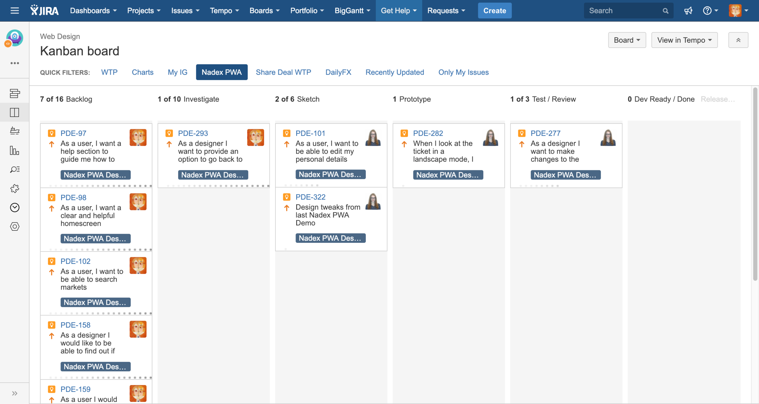
I led the UX for the majority of the project, from initial scoping through to the launch of the primary trading and account management flows. As the project developed, I brought in a UI designer and a junior UX designer, expanding the team to three. I was responsible for setting the design direction, introducing the processes that structured the team’s work as scope increased, and guiding the design decisions throughout. I also organised and facilitated the design sprint that shaped the vision for the subsequent desktop platform.
Process
Establishing a design workflow
When I joined the project, the team was new and there was no established design process. My starting point was Lean UX: setting clear hypotheses for each design decision, conducting the minimum research needed to validate or invalidate them, and moving to the next problem. Given the business urgency, this was the appropriate approach for the early stage.
As the team grew to three designers, I introduced a Dual-Track Sprint structure to manage the expanding workload. The research track ran ahead of the design track, ensuring that design work was grounded in findings rather than assumptions, and that the team was not blocked waiting for insight when design production was ready to proceed. The cost of designing without insight only becomes visible once you have done it.
The team held weekly design grooming sessions with the Product Owner to review backlog priorities, weekly design critique sessions with business stakeholders for feedback and approval, and regular feasibility reviews with the development team. This rhythm reduced the number of late-stage surprises that had previously disrupted delivery.
Closing the research gap
One of the substantive challenges at the outset was that the London-based team had limited knowledge of Nadex’s U.S. user base. U.S. retail trading clients have different regulatory contexts, different familiarity with binary options products, and different support expectations to IG’s European clients. Designing without that knowledge would have meant building on assumptions that would only be tested in production. Given the scale of the KYC failure rates already in the data, that was not a risk I was willing to accept.
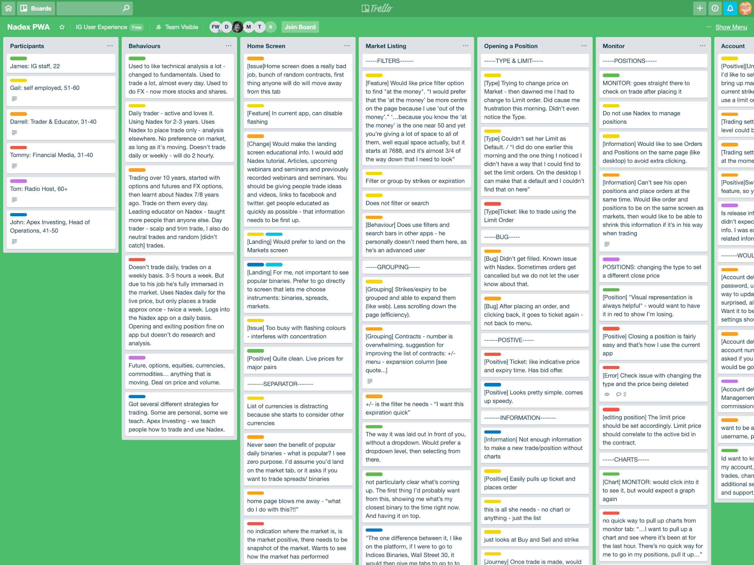
Working with IG’s research manager, I made the case for including ad-hoc research studies in the project plan rather than treating research as a one-off activity. We documented and shared findings through Trello, creating a running record of what we were learning that the whole team could reference between formal sessions.
A consistent approach to complex flows
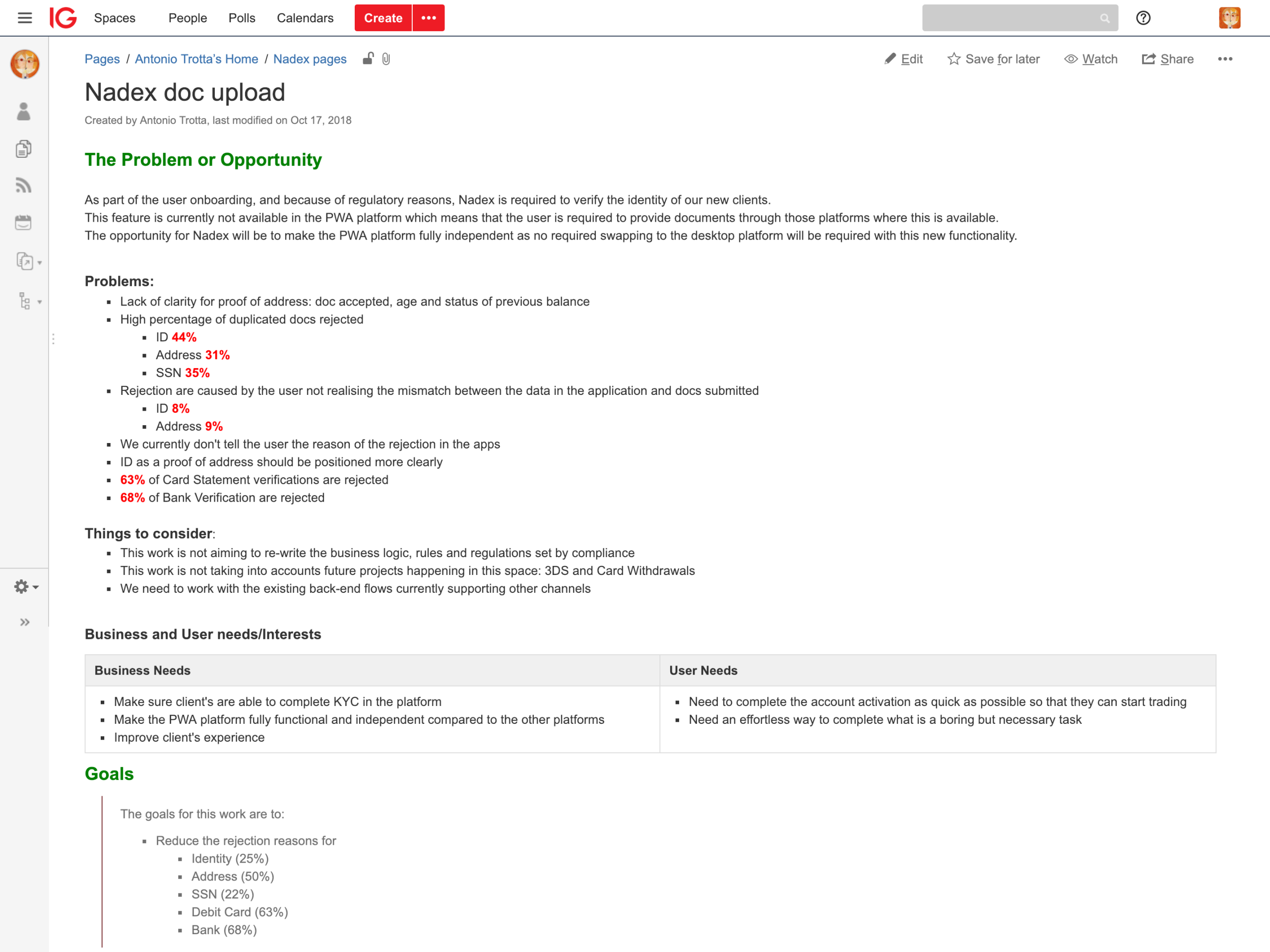
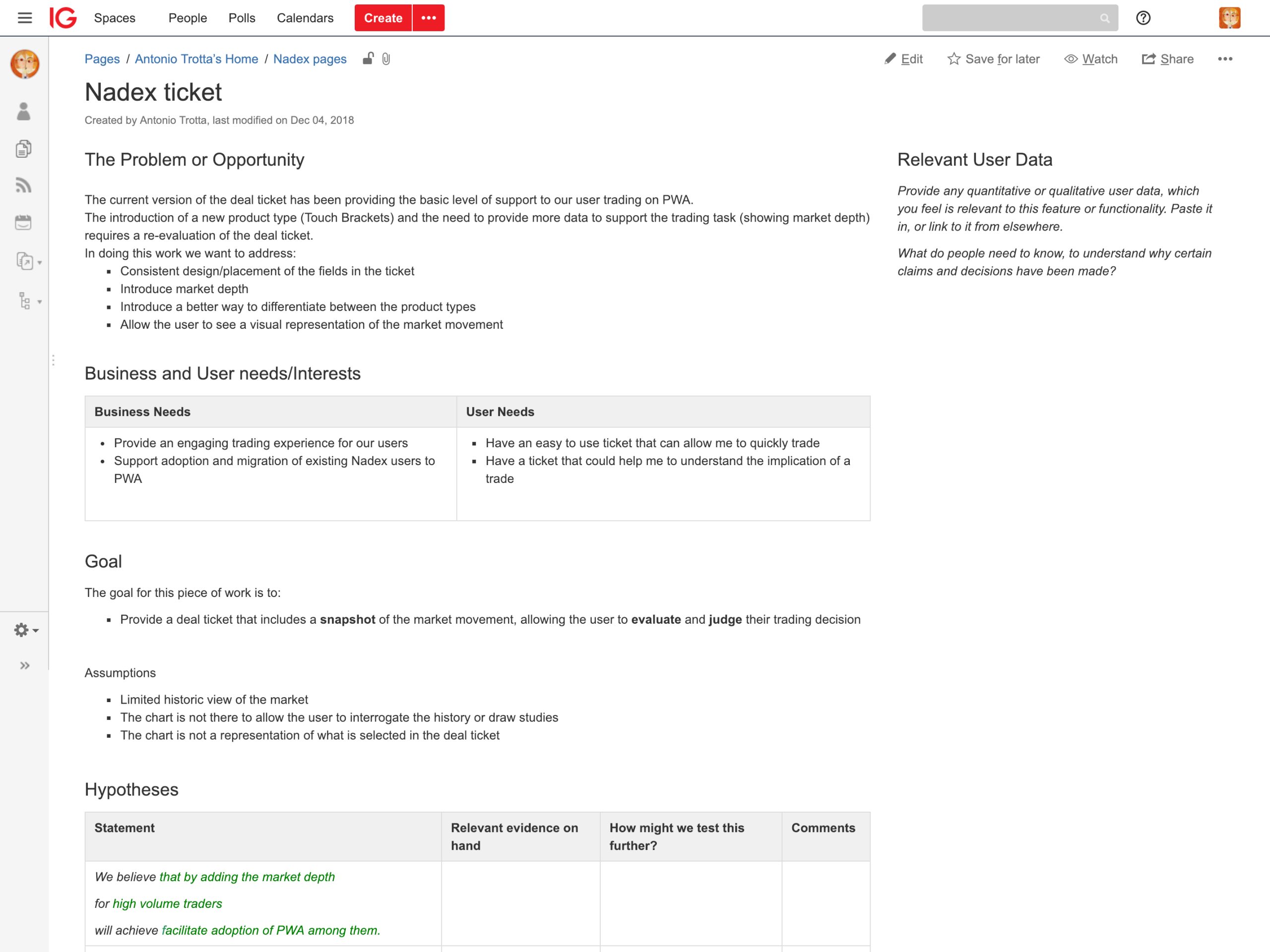
As I worked through the intricacies of the app and its services, I created a wiki template for organising design analysis. Rather than approaching each problem from scattered notes, every flow was worked through using a structured document capturing the problem statement, business and user requirements, relevant research, hypotheses, known constraints, and initial design directions. This became the central collaboration tool for the team.
Identity verification
A specific fix for a specific cause
The KYC flows for identity, address, and Social Security Number verification presented a clear research-led design opportunity. Analysis of the existing flow revealed that 8% of identity document rejections were occurring because the information on the submitted document did not match the data provided during account setup. This was not a UI problem in the conventional sense. Users were being asked to verify information they had supplied months earlier, with no prompt about what that information was.
The fix was deliberate and specific: a prompt at the start of each verification process surfacing the account data on record, giving users the opportunity to reconcile any discrepancy before submitting their documents. The same principle informed the address verification redesign, where rejections were occurring because users were submitting documents that did not qualify as proof of address. Rather than relying on users to find and retain eligibility criteria from a separate help page, the redesign brought that guidance into the flow at the point where it was relevant.
This kind of focused, cause-specific fix is more valuable than a broad usability improvement. The research identified a precise mechanism. The design addressed that mechanism directly. The metric reflected the fix. Design rationale, KYC flows
Identity verification redesign: 8% of document rejections were caused by data mismatches between submitted documents and stored account information led to a targeted fix with document rejection rates falling by 42%.
Address verification redesign: Research showed that a significant proportion of rejections were caused by users submitting non-qualifying documents, not because they were being careless, but because the eligibility criteria were only visible on a separate help page most users never consulted. Moving the guidance into the flow at the point of decision reduced rejections without changing the eligibility rules.
Deal ticket
Designing for a critical decision moment
The deal ticket is the centrepiece of any trading interface. It is the moment a client commits capital, and the quality of that interface has a direct bearing on confidence and accuracy. The Nadex deal ticket received substantial design attention.
The most significant change I introduced was a mini chart embedded within the dealing interface, showing current market movement and key levels for the instrument being traded. In binary options, where the outcome of a position depends on whether a price is above or below a specific level at expiry, having that market context visible at the moment of deal entry is not an optional enhancement. It is a meaningful improvement to the decision-making environment.
Deal ticket with embedded mini chart. Binary options trading requires a clear view of where the current price sits relative to the expiry level. Integrating a live chart into the deal ticket gave clients that context without requiring them to navigate away from the dealing interface at the point of decision.
Outcomes
Cause-specific design, measurable result
The focused redesign of the KYC flows reduced document rejection rates by 42%. Account activation rates increased by 8%, reflecting the improvement in the clarity and success rate of the verification process as a whole.
These results came from a single, well-defined insight: that rejection was not caused by user carelessness, but by a design that withheld the information users needed at the moment they needed it. The metric improvement was a direct consequence of the design decision.
Reflection
Building a documented research practice
The most transferable decision on this project was building a documented research practice into the project rhythm from the outset. In a distributed team working with an unfamiliar market, assumptions tend to go unchallenged because no one has the context to question them. Documenting findings through Trello, however informally, meant that design decisions could be traced back to evidence and that the team’s collective understanding accumulated across the project rather than dissipating between sessions.
The Dual-Track Sprint structure served a similar purpose. It was not the most efficient approach in the short term. But it prevented the design team from having to choose between moving fast and staying informed, and that trade-off has a cost that only becomes apparent after the fact.