Conversion Funnel and Sign-Up Flow
In 2015, IG Group launched a two-year programme to address a sign-up journey that had grown by accretion rather than design. Applicant numbers were up 70% and first-trade conversion had more than doubled by the time it ended.
Context
Regulatory change, new competition, growing mobile traffic
In 2015, IG Group faced a convergence of pressures on its retail investor sign-up journey. Regulatory changes required modifications to the account creation process. New competitors were entering the market with more streamlined onboarding experiences. And the growing proportion of mobile traffic meant that a form-heavy, desktop-centric sign-up flow was working actively against conversion. The business responded by launching a two-year improvement programme, “Better Conversion Funnel”, to address the sign-up experience systematically rather than reactively.
Problem
A form that had grown by accretion
The existing sign-up journey had accumulated problems characteristic of a form that had grown by accretion rather than design. A date-of-birth field that frustrated mobile users. A username field that served no meaningful purpose for clients but added cognitive load. Unnecessary questions increasing drop-off rates. Pages so long they were effectively unusable on smaller screens. And an Application Result Page that had reached 46 distinct variations, a situation that made consistent, clear communication to applicants essentially impossible.
These were not subtle usability problems. They were identifiable friction points with direct consequences for conversion, and there was no good reason for most of them to exist.
My role
Sole UX designer across the full arc
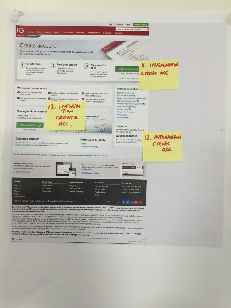
I was the sole UX designer on this project throughout its duration. I conducted the research, produced the wireframes, developed interactive prototypes, and facilitated internal usability testing across multiple phases. The project ran over two years, and my involvement covered the full arc from initial discovery through to iterative refinement of the final designs.
Discovery
Identifying the drop-off points
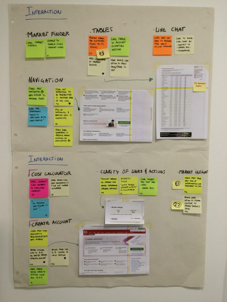
The project began with a structured assessment of the existing sign-up journey. I mapped the current flow end-to-end, starting form the website identifying where applicants were abandoning the process and what the available analytics and research suggested about the cause. This established a clear baseline and a set of specific hypotheses to test, rather than a general mandate to make the journey “better.”
Users tend to go straight to the create-account form rather than reading the surrounding page, so any information they need (eligibility, benefits, account manager) has to be present at that moment, not buried elsewhere. Behaviourally they also expect to be accepted when they apply, and many arrive cautious (“I’ve been burnt in the past,” “takes time to read the small print”), so reassurance and clear expectations matter here more than on most pages.
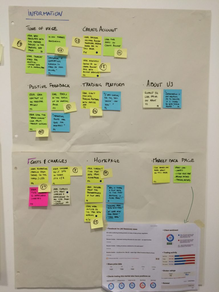
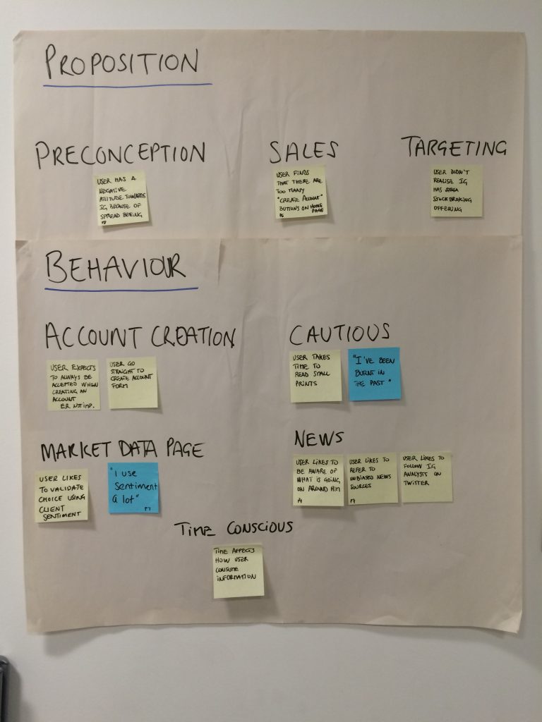
Users tend to go straight to the create-account form rather than reading the surrounding page — so any information they need (eligibility, benefits, account manager) has to be present at that moment, not buried elsewhere. Behaviourally they also expect to be accepted when they apply, and many arrive cautious (“I’ve been burnt in the past,” “takes time to read the small print”), so reassurance and clear expectations matter here more than on most pages.
The largest drop-offs were concentrated at predictable friction points: the date-of-birth field, the username creation step, and the Application Result Page. Each had a different root cause, which meant the design responses needed to be different too. The temptation in a project like this is to treat every friction point as the same kind of problem. They are not.
Sprint output reviewed with the Nadex Chicago team and tested with premium clients. The research session identified the design directions that resonated most strongly with experienced users and the areas that needed further iteration.
Competitor analysis: establishing the benchmark
Before designing any improvements, I conducted a systematic competitor analysis covering field requirements, form language and label clarity, account creation flow structure, and Terms and Conditions integration across competitor platforms. The goal was not to reproduce what competitors were doing, but to establish a benchmark for what a well-designed sign-up journey looked like at the time, and to identify patterns that recurred across multiple platforms because they demonstrably worked.
The analysis made clear that the IG sign-up journey was an outlier, not just in length but in how it communicated the purpose of individual fields and the reason for each step. Several competitors were achieving account creation in significantly fewer steps without any apparent reduction in the information collected.
Competitor analysis framework. Evaluating competitor platforms against consistent criteria produced a clear picture of where the IG journey diverged from established norms, and where those divergences were generating friction rather than adding value.
Design
Reducing friction at each step
The redesigned journey addressed the specific friction points identified in the drop-off analysis. Account creation was accessible from the first page. The username field was removed. The date-of-birth input was optimised for mobile. Form length was reduced by removing questions that served internal needs but had no clear value for the applicant at the point of sign-up. Progress indicators, tooltips, and real-time validation were added to reduce uncertainty at each step and prevent submission errors.
The reduction in form length was not achieved by removing necessary information. It was achieved by distinguishing between what the business needed to collect and what was genuinely required at the point of account creation. Several fields present in the original form were deferred to later in the onboarding journey, where they were contextually appropriate and less disruptive.
Sign-up flow redesign. The reduction in field count came from distinguishing between what needed to be collected at sign-up and what could be gathered later in onboarding, without losing any of the information the business required.
Application Result Page
From 46 variations to three actions
The Application Result Page presented a particular challenge. Forty-six variations had accumulated over time, each addressing a slightly different post-application state, without a coherent framework for what the page needed to do. Each variation had probably been created for a legitimate reason. The accumulation was the problem.
I stepped back from the individual cases and asked what the page needed to accomplish in principle, across all scenarios: give the applicant a clear next step, appropriate to the state of their account. The answer was three actions: Fund Your Account, Access Your Platform, and Submit Documents for KYC. The redesigned page was structured around those three actions, with the content varying by account state rather than the layout varying by case.
Designing for principles rather than for cases. The redesign did not require new information. It required a clearer framework for what the page was supposed to accomplish. Application Result Page, design rationale
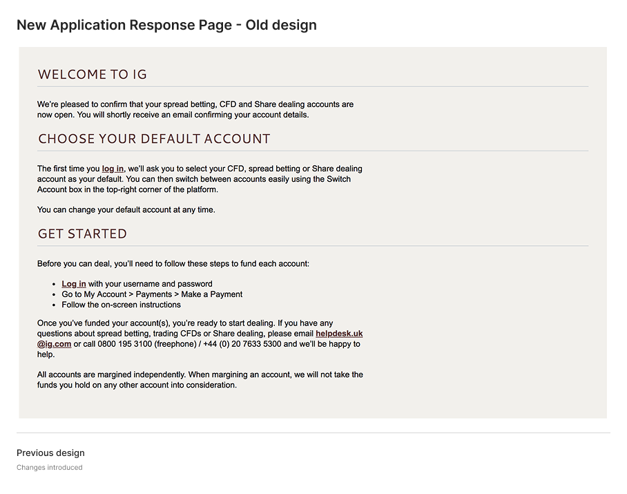
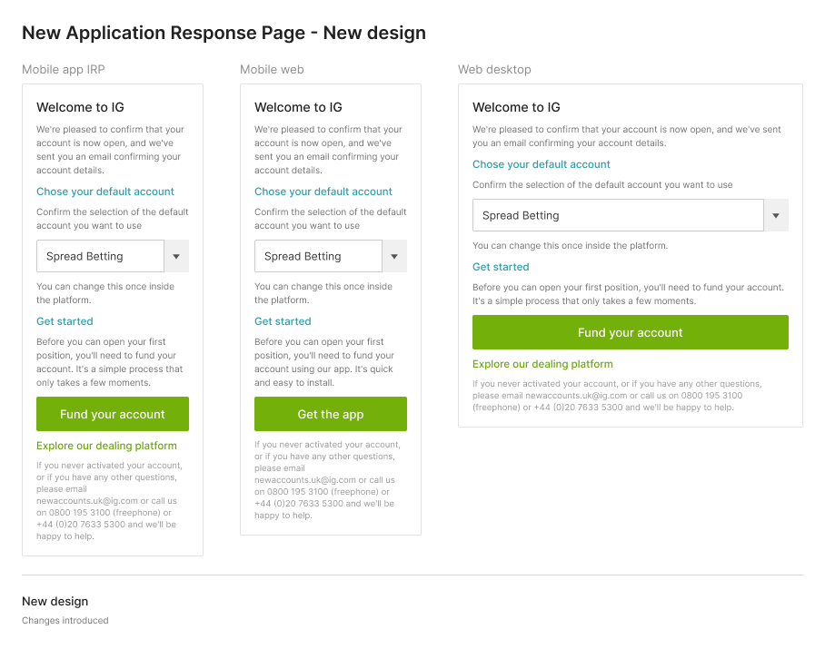
Application Result Page redesign. Forty-six variations consolidated into a single, state-responsive page structured around three actions. The redesign did not require new information. It required a clearer framework for what the page was supposed to accomplish.
Research
40 users across multiple phases
The iterative testing process involved 40 users across multiple research sessions. Each session gathered task completion rates, error frequencies, and qualitative observations about where the design was working and where it was creating confusion. Testing across multiple phases meant that design changes could be validated before being committed to development, and regressions introduced by modifications could be identified before reaching production.
The “Occupation and Industry” field showed consistent anomalies in user interaction patterns across sessions, prompting a deeper investigation into whether the field’s purpose and label were being understood. Further analysis of quantitative data helped defining the need to make changes to the interaction design.
Redesigning the occupation and industry fields. I started with a month of UK and Singapore analytics to find where people stalled, then weighed three options in the open before shipping the two combo boxes that let people keep typing while the industry placed broad job titles.
Outcomes
Both primary targets substantially exceeded
Applicant numbers increased by 70% in 2016 compared to 2015. First-trade conversion improved from 21.3% to 47.7% within four weeks of the redesigned journey going live. Both were primary business targets for the Better Conversion Funnel programme, and both were substantially exceeded.
The first-trade conversion figure is the more significant of the two. Increasing applicant numbers reflects a better sign-up experience. A 47.7% first-trade rate reflects an onboarding experience that was not just converting more sign-ups but producing more clients who were ready and motivated to engage with the platform. The two metrics together indicate that the redesign improved quality of entry as well as volume.
Reflection
Principles over cases, trajectories over snapshots
The most instructive part of this project was the Application Result Page. The 46 variations were a symptom of a practice that had been responding to individual edge cases without ever establishing a framework. The redesign worked because it stepped back from the individual cases and asked what the page needed to do in principle. That distinction (designing for principles rather than for cases) is one I have returned to in subsequent projects.
Running research across multiple phases rather than a single round was the other decision that shaped the outcome significantly. Single-round testing produces a snapshot. Iterative testing produces a trajectory. The difference between the first design and the final one was not visible in the initial test. It became visible over successive rounds as each change was validated or challenged.